~2 Flex-Box Properties Foundations~
1/29/2024

The original way of doing things
Let’s first take a look at how things were done in the beginning. We had:
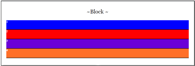
Block
The default behavior of any HTML document is to display their items in a block style fashion. When you are using this method, you will find that your div will take up an entire line.
This really doesn’t even matter if you set up the width of each item to be 100% or not. If you set your width to be lower than 100%, your text and words might not take up the full width of the page, but that div will still take up one line of space and push the next element to be down below it.
HTML
<div class="box blue"> 1 </div>
<div class="box red"> 2 </div>
<div class="box purple"> 3 </div>
<div class="box orange"> 4 </div>
CSS
.box {
border-bottom: 2px solid black;
height: 50px;
color: #FFF;
}
.box.red {
background-color: #F00;
}
.box.blue {
background-color: #00F;
}
.box.purple {
background-color: #6B00D7;
}
.box.orange {
background-color: #FF6F28;
}
Setting the block width to 30%
Now let’s set that block to 30%
CSS
.box {
border-bottom: 2px solid black;
height: 50px;
color: #FFF;
width: 30%;
}
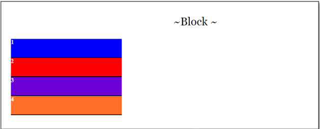
See above, how it took the 4 divs and stacked them one on top of the other. So, we still do not have them in a row.
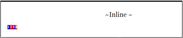
To set the box to be in the same row, or inline
CSS
.box {
display: inline;
border-bottom: 2px solid black;
height: 50px;
color: #FFF;
width: 30%;
}
Hmmmm… those boxes are just a bit small, but we do have them next to each other.
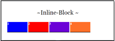
Inline-Block
You can use a <span> instead of a div, but let’s increase the width of those boxes just a bit.
You will see that if you try to set an inline element’s width, you can fight it all day, and it just will not work. In order to set a width and have your boxes set in a row, you must set it to inline-block.
CSS
.box {
border-bottom: 2px solid black;
width: 20%;
height: 50px;
display: inline-block;
color: #FFF;
}
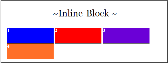
Ok, well now that works, but what happens if we set that width to 30% and then resize it to be the width of a smart phone.
Yes, inline block is not all that flexible, and just one box at the bottom of this layout seem just about…well, off.
FLEX-BOX
This is where our new flex-box layout steps in and outshines that old ancient way of doing things. Flex-box is not a property, as is the case with block or inline. Flexbox is a module, which contain many properties belonging to itself. In some ways you can kind of think of this module thing as a type of container itself. But flex-box does have its own property named container, and we are going to learn about that next.
The Container
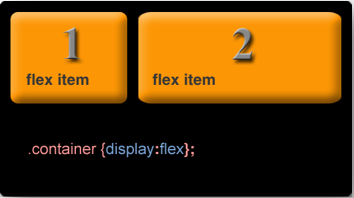
If we want the elements on our page to be flexible, we are going to first need to set them into a container. Think of a container like a layer, you can have multiple containers on your page, and if you want different sections of your page to flex independently of one another, you will need to put each flexible section into its own container.
Only use the display property of flex on the container, not on the elements that it contains. Even though, you could nest containers. The individual items inside of it should not have their display set to flex.
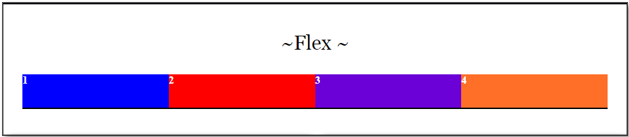
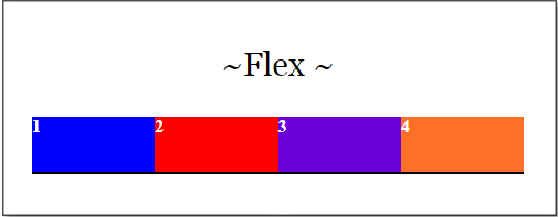
Let’s look at what happens if we simply place some divs into a container and set that container to display as flex. The boxes now will resize with the width of the page. It will not overflow its container, and one single box will not end off on a line by itself.
Below, you will see just images, they will not flex. The first image shows you what it would look like with a full 1200 width page. The second image shows you how it will resize and organize itself for a cell phone size.
Give this code a try in your own website code interpreter to see it in action for yourself.
Centering Elements with Flex
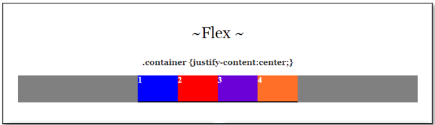
If you want those items to be centered inside of the flex row of items, we us justify-content: center; Let’s change the width of the box to 10% so we are able to demonstrate the centering a bit better
CSS
.box {
border-bottom: 2px solid black;
width: 10%;
height: 50px;
color: #FFF;
}
.container {
display: flex;
justify-content: center;
background: gray;
}
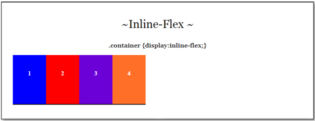
The Difference between flex and inline-flex
Ok, so what is the difference between using just plain flex, or stating that it is actually the inline flex that you want.
Well, changing flex to inline flex will force the container to take up the necessary space which matches the size of its inner elements, or children as they are sometimes referred. Let's also add just a bit of padding to the box as well.
CSS
.box {
border-bottom: 2px solid black;
width: 30%;
padding: 40px;
height: 50px;
color: #FFF;
}
.container {
display: inline-flex;
background: gray;
}