~5 Flex-Box Product Page~
2/19/2024
Restrict Maximum Size of Images
Adding a Button to the Product Card
The code that I will be presenting in this Product page tutorial will be like an insert to a pre-existing web page that you already have.
The Select Options Dropdown
Creating this dropdown might seem a bit in-depth, but really there is not too much to it, and it should not give you any nightmares just thinking about attempting it.
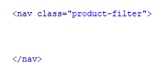
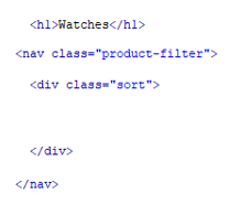
We will be putting this select dropdown widget inside of a navigation. We can call this navigation anything we want but for now we will just be giving it a class of product-filter, since that is what it will be doing.
The HTML
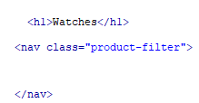
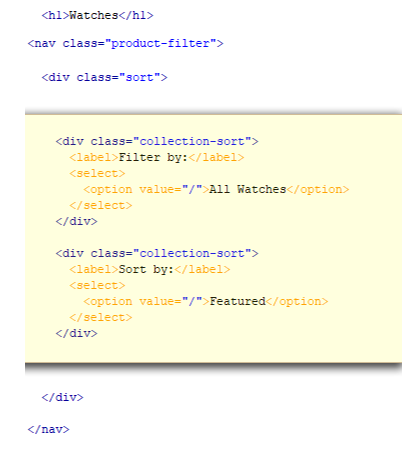
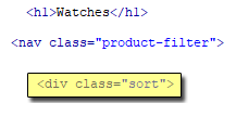
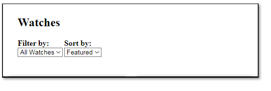
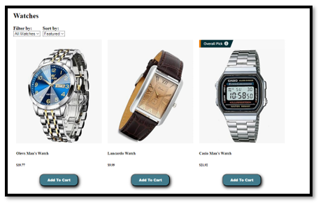
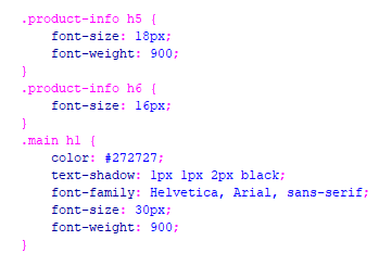
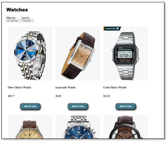
Next thing that we will be doing is to give it a heading. This would reflect what we wanted to sell. I just put “Watches” in for the heading, but of course you can use anything here that you want. Place this h1 above the navigation section.
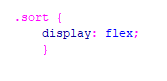
The next thing that we will specify inside of the navigation, is our select widget, we will give this the class name of “sort.”
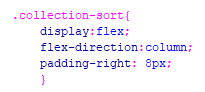
Inside of the div “sort” which is our select widget, we are going to have two dropdown options. We will put each of these dropdown options in their own divs, and give these two the class with the name of “collection-sort”
Each drop down will consist of a label, so we know what we are selecting and then the select-option, To create this, we will be putting the option tag with the value inside of a tag named select.
The CSS
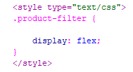
Since, in the HTML, we placed this entire thing into the navigation, which we named “product-filter”, we will use that to be our flex element. So, we will set the display of product-filter to flex.
Setting the .sort div to flex
If you look at your html, you will see that we placed our two div options into another div with a class name of .sort. We can nest our flex containers, which is just what we are doing with sort, this is because we will set sort to be displayed as flex, inside of the product-filter div that we have already designated as a flex container.
The CSS for the .sort
Setting the .collection-sort div
We are giving our drop-down options to display as flex, yes this is yet another flex container to be placed inside of the outer two containers. Then we want the labels of Filter by: and Sort by: to sit on top of the two dropdowns, so we set this container direction to be column. I also added a bit of padding so that the two widgets have a tiny bit of space between them.
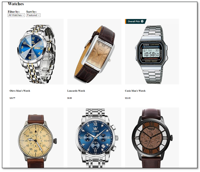
When we save, and run it in a browser, you should have this:
The Products Layout
Note- You want to make sure that all of your product images are the same size. Create a background image, the size that you want. Slide all of your products onto this background image, one by one, and then save your images.
The HTML
In the html, right under the navigation section, we want to create our product display for the page
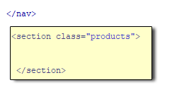
Inside of this section tag, we want to start adding the images and descriptions of our products. We will start with just one, and then work from there.
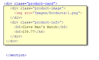
Note- You will probably want to link this card somewhere to an individual product page. you could add a button in the info, link the titles, or even wrap the entire card in an anchor tag.
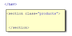
Right below the section that we highlighted in yellow and before the closing section tag is where you will want to add additional products.
Now you want to add that yellow section, to create 9 more cards to work with. Remember that this is the tag that you are putting all of those product cards into. This section was placed under the navigation
The CSS for the .products section
Before you set the following rules for the .products section, you will find that the products are just dropping down in a single column. That is because it was following the rule that you had set for the dropdown box in the navigation, which was with a flex direction of column. We want this to do something different so we will be giving it, its own flex container and setting that container to have its contents wrap.
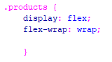
As you can see, here the products are no longer in a single column, and now the products will wrap, when the page is widened or narrowed.
Using flex-wrap: wrap will force the items onto the next row, once the page is narrowed enough that it does not fit.
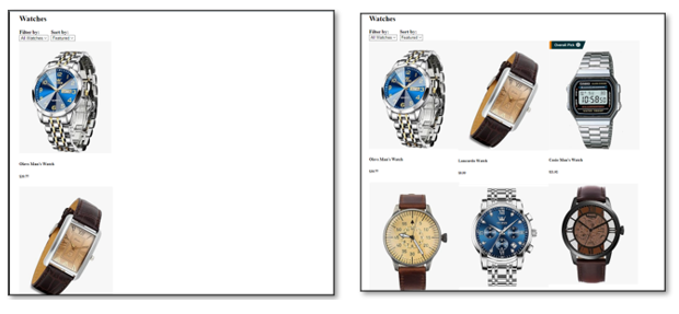
Using Flex grow
We want to take further control on how things move on the page by taking advantage of flex-grow. We will start out by placing everything on one row by simply setting flex-grow:1; This will be done on each one of the product cards
To do this, we want to add some more properties to the .products rule. Like this:
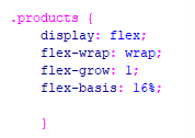
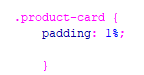
Now we want to add a bit of the padding. The padding will actually go on the .product-card rule. I am only adding a 1% padding to my cards, so they have just a bit of space between them.
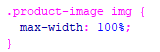
Restrict Maximum Size of Images
You do not want your images growing too large and distorting. To prevent this, we can add this code to our CSS
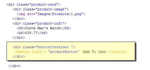
Adding a Button to the Product Card
The HTML
The CSS
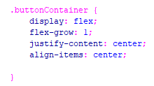
We will be styling both the container and the product button. We are surrounding the button with a div tag and naming the class, the buttonContainer, because that is what it will be. We are setting the display for the buttonContainer to flex. Also, we want the center align it both horizontally and vertically so it will set exactly center in the div. And then we set the flex-grow to be 1.
Now this is for the styling for button itself
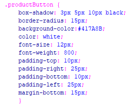
I also did a bit of restyling of some of the text, so that it looked a little better on the page
So, now my page looks like this:
You can go here to get the full HTML and CSS for this product page