~6 The Hamburger Menu~
8/12/2024
Creating the Partial Menu File
The code for the _menu.scss file
The Menu-btn for the Hamburger Menu
Changing the bottom bar to not be the same width
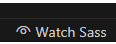
Turn on Sass
In Visual Studio
Remember to turn on your Watch Sass
Creating the Partial Menu File
Here we are going to start working on our menu. To begin this, we will create a new partial file to deal with just the menus in this site, like we did with our home page.
Create a new file
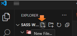
Name it _menu.scss
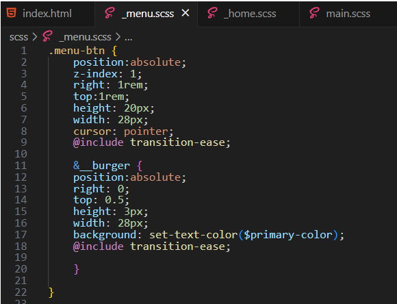
The code for the _menu.scss file
.menu-btn {
position:absolute;
z-index: 1;
right: 1rem;
top:1rem;
height: 20px;
width: 28px;
cursor: pointer;
@include transition-ease;
&__burger {
position:absolute;
right: 0;
top: 0.5;
height: 3px;
width: 28px;
background: set-text-color($primary-color);
@include transition-ease;
}
}
Notice how the burger menu was nested inside of the menu-btn class using the &__
In CSS we used to use just dot notation for a child element to reach the parent; but in SASS, we use the ampersand with a double underscore.
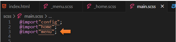
@include the partial file
Remember to Import this partial at the top of the main.scss file
The Menu-btn for the Hamburger Menu
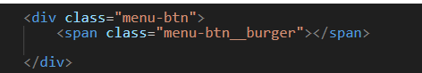
If you look at the html code, you will see that the menu button is basically a wrapper. We will be using this as a click event. Within the menu-btn, we will have our bars for the hamburger.
Go to the _menu partial file.
When we wrote the code in the menu partial for the nested hamburger, all that we had configured, so far was the middle bar. You will notice in the menu partial, that we set this middle bar to a width of 28px. Now we are going to use pseudo elements to create the other bars of the hamburger.
* Careful, on this one, if you do not put in both a width and a height for our hamburger line, it will not show up
To Add the Before pseudo code
*Watch it, do not include any space when you write the &::before or it will not work.
The reason that we need that empty content tag to begin with (below), is that it creates a type of invisible element, which we can style with SASS. It must be here, or your styles will not have anything to work with. You will figure this out real fast if you forget and leave that first line out.
&::before {
content: '';
position: absolute;
top: -8px;
width: 28px;
height: 3px;
background: set-text-color($primary-color);
@include transition-ease;
}
To Test the menu code
Go to the index.html file.

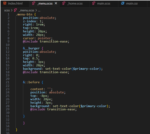
To Add the After pseudo code
We need this line to go under the middle line, so we need to increase that top property. This will move this element down underneath that middle line. To do this, we just remove the – sign in front of the 8px.
*Watch it, do not include any space when you write the &::after or it will not work.
&::after {
content: '';
position: absolute;
top: 8px;
width: 28px;
height: 3px;
background: set-text-color($primary-color);
@include transition-ease;
}
Now your hamburger menu should look like this, with a line above and below that middle line.
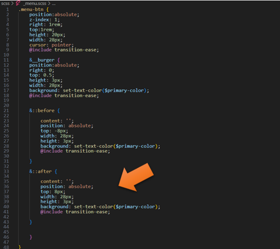
Changing the bottom bar to not be the same width
This is easy just change the width in the &::after to be:
width: 20px;
.menu-btn {
position:absolute;
z-index: 1;
right: 1rem;
top:1rem;
height: 20px;
width: 28px;
cursor: pointer;
@include transition-ease;
&__burger {
position:absolute;
right: 0;
top: 0.5;
height: 3px;
width: 28px;
background: set-text-color($primary-color);
@include transition-ease;
&::before {
content: '';
position: absolute;
top: -8px;
width: 28px;
height: 3px;
background: set-text-color($primary-color);
@include transition-ease;
}
&::after {
content: '';
position: absolute;
top: 8px;
width: 20px;
height: 3px;
background: set-text-color($primary-color);
@include transition-ease;
}
}
}
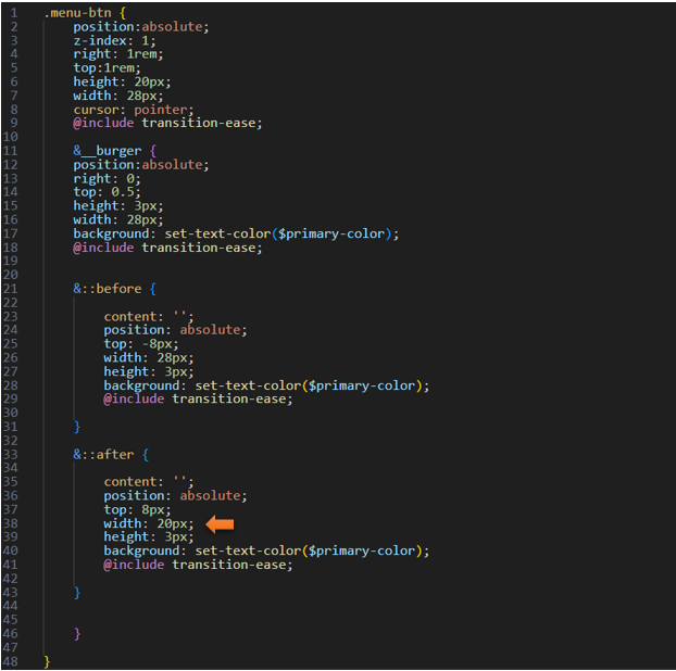
Now that bottom line should look like this.

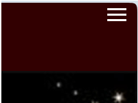
And this is what the hamburger menu should look like on the web page, sitting in the upper right-hand corner.

Animate the hamburger
We will be using Java script to make the hamburger menu interactive
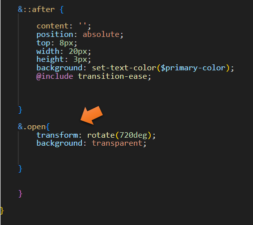
&::after {
content: '';
position: absolute;
top: 8px;
width: 20px;
height: 3px;
background: set-text-color($primary-color);
@include transition-ease;
}
&.open{
transform: rotate(720deg);
background: transparent;
}
}
}
*Watch it, right now, this code will not do anything. In our next tutorial, we will be looking at doing the JavaScript for it.